 |
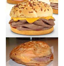
It’s no huge secret that fast food ads don’t exactly portray the reality of what you’re being served. When you’re ordering you gaze upon countless pictures of perfectly cooked and beautifully presented items, and what gets thrown in front of you ends up looking so dramatically different you can hardly call it the same item.
Well, the website This Piggy has done everyone a favor by compiling a list showing side-by-side comparisons of what is advertised and what is served. We’d say salads seem to fare the worst (and also the famous bowl), but you might as well take a look and judge for yourself.
